Search This Blog
Sunday, March 28, 2021
Light concepts to follow
Friday, March 26, 2021
Tips on the Color of Light and mood
The Color of Light and Mood
All paintings are made up of light. How we describe the light directly affects the mood. A good value map will help you decide what colors to use to help tell your story. After much practice color choices will become intuitive for you. A challenge for you, would be to identify the color and light affects on your subject at different times of the day. Wherever you go through out your day be very observant to the subtle effects that happen in shadow; is it blue, purple? What color is the surrounding light compared to the shadow? Really open your eyes to this in nature. It will open a whole new world to you. This type of observation could be explored your whole life. Monet did this when he painted the different lighting conditions with his haystacks.
With your observations of light, mood and feeling will automatically interact together and show in your paintings. They are apart of light, so therefore you will become intuitive to mood and feelings of a painting. It also is why people are attracted to certain art works. Some paintings inspire us to remember favorite past memories. The painting will tell us a story that connects us to a favorite place, mood or even in the color palette. It makes the painting magical to us.
Bright sunny days may inspire a cheerful mood; overcast days may describe a somber reflective mood, and misty fog may invite feelings of mystery.
![]() |
| 5x7 study of overcast day, Moody |
This is a little study to express mood. The lighting was overcast with threatening clouds overhead in the golden hills of California. My objective here was to study the light. Other than the barn structure (or upright planes) everything is in a similar value. The sky is gray and all the colors are muted. It's not just a copy of a photo, but a feeling of the day. The clouds are heavy and close to the ground to help support the feeling I had on this day.
So how does light effect the different seasons? When starting to paint, the planning stages require us to ask these kinds of questions. Put it down on paper so you can be reminded of the story you want to say to the viewer. This is your vision, express it in your own personal way.
Light effects with the seasons
Summer
![]() |
| 9x12 watercolor study girls at the Bach |
Fall
![]() |
| Del Puerto Canyon Fall |
Winter
![]() |
| winter study 9x12 |
The sky is usually the lightest in the cloudy winter or overcast day. Colors get grayer and duller as you recede back into the landscape. Clouds that are big and fluffy are very luminous in this sky. Ground colors are usually not influenced by other sky colors in this condition and remain true to their local colors. You will see softer edges and soft contrasts in a winter scene. The muted colors and low key values are usually typical. Ask yourself do the dark colors get lighter in the distance and do the light colors get darker? What does a gray sky look like? Is it purples and muted colors? As long as the values are right this is where hidden mood lies. Reach into the landscape and see if you can pull these colors out. Shadows will also be muted, and upright planes can be more vibrant.
Spring
![]() |
| 5x7 study of spring early light |
Thursday, March 25, 2021
Understanding Light and Shadow
Light and Shadow
How do we use it to make better paintings
Suggestions to start a painting
Often I think we as artist are moved by a scene. We forget to ask ourselves the most important of questions "What is it I want to say about this scene?" "How does this scene make me feel?" This scene is particularly moving to me. It brings back many memories that I have. We went camping for a week in the back country next to Yosemite. It was an adventure, lush scenery and always brought peace to me. I really miss those days. That was 25 years ago, but I am able to invoke in this painting that feeling of togetherness, serenity and warmth that I felt on that day. This is one of the main reason it is important to use your on reference material for your paintings. Some, may not be able to do this because of physical restraints, but art is anything that moves you. Even simple household objects can become art. Isn't our goal as artist to show others (who may not be able to see the beauty in everyday objects) where that beauty lies? There is such a rush in our everyday lives that most of us don't notice the beauty that is right in front of us.
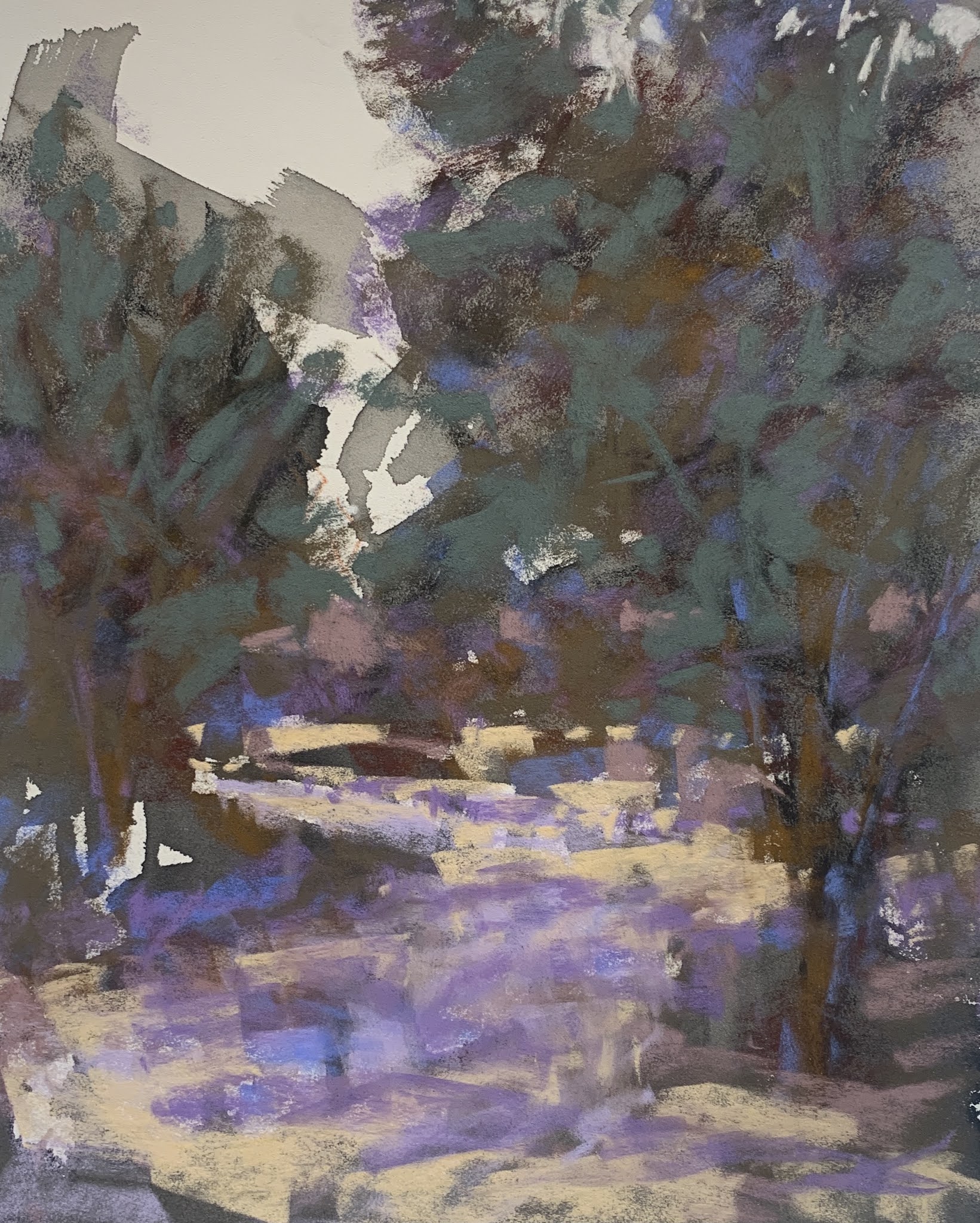
With this particular painting, the line concepts all point to the riders. Follow the background tree line, it merges with the riders or points to them if you will. The dark pine trees encircle them, the path then leads you in from the bottom of the painting. You are able to re-enter with any of the shadows in the foreground. The hardest edges are the riders and the dark tree trunks around them. Yellows and golds come forward in the painting, while the cooler and grayer colors recede and take you into the painting. There is division of space with the little tree in front of the tall pines and then the background trees. I wanted to express the magnificent majestic feeling it is to travel under trees that have lived for so long.
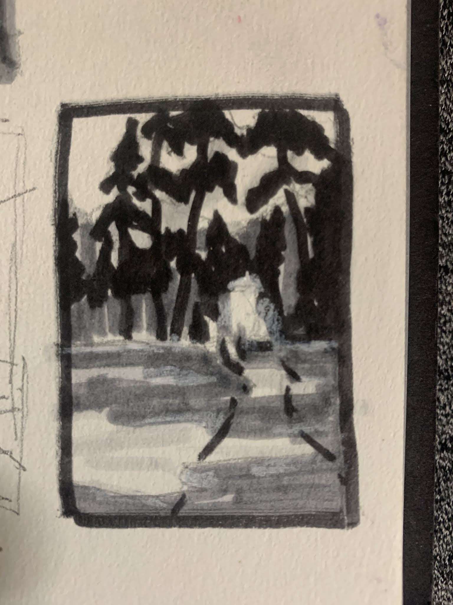
This is the line concept I used to design the composition with. See the box off center & to the right? This is the representation of the riders. I felt I was going in a good direction with the composition after I quickly jotted this down. It doesn't have to be anything elaborate, just notes to yourself. Use this like a map. If you do this prep work consistently in your work you will have more paintings that are successful instead of just once in awhile. There will come a time with repetition that this becomes automatic and you might not need to actually record it. But, it will be in your mind.
Always remember, shadows are usually 40% darker in value then the object in the light. They also, are shades darker from the original color of the object. There can be color that bounces off the object onto another in a shadow. Example would be a red ball in light with a reflection on a blue wall will have a hint of the red on the wall too. Usually, in the landscape on sunny days the shadows will reflect some blue from the sky, and cool violets. Observe closely objects in nature and shadow. This will help you understand the concepts and re-produce them in your art.
Remember to feel your way through a painting. Invoke what moved you within your subject with value, line, color and intervals that are interesting. Watch you shapes, are they interesting? Do they all look the same? Do I have soft and hard edges, contrast next to the focal point? Be careful to identify tangents. Our brains just go there unfortunately and we have to make a conscious effort to review these important questions before we release a painting to the public.
Tuesday, March 23, 2021
How to Bring a Painting Together
Ride to summer camp
![]() |
| 14x20 |
Saturday, March 13, 2021
Painting what you see
Keeping it loose
- Take the photo - thumbnail and frame it with a dark L shape mats to really pop out the area of the photo you find interesting. Remember each photo can have multiple areas of interest for paintings.
- Find the horizon line and mark it with a marker. (I use 3 values of TomBow markers). Do the darks first. Then, block in the midvalue. Let the lights be the light of the paper. Use the main structures only in the scene for this. It's ok to cut parts out of the photo. Leave big uninteresting areas that scream for attention out. It's ok to not look at the photo. Try really hard to not look at the photo for any detail. Keep it simple. It's ok to cut the sky out if to much, and ok to leave large foregrounds out too. Very SIMPLE is key
- With your markers draw a 2x3 box and work out the simple shapes only. Is the composition pleasing? When you have worked that out you can transfer it to the painting surface.
- Block in the big simple dark areas. Just shade it in. No need to draw, your objective is to stay loose. use an old brush to wipe out some of the charcoal to show a value change if you want like I did on the side of the mountain.
![]() |
| This was blocked in with wood charcoal |
- The example above was completed on a half sheet of art spectrum paper in gray.
- Remember, to paint
- Dark to Light
- Light touch to thick strokes
- background to foreground
- Squint Squint and Squint again to see shapes and values. Do this throughout the painting process and step back often to evaluate
- Use broad strokes, light touch to identify local colors
- Block in darker background trees or objects, use a mid value color to start with
- Then move to background (far distance)
- Try out a sky color, when you find the color you want put that in. Make sure to use a light touch around the foreground tree shapes so you can add sky holes later
- Remember to play down non focal area
- Not important objects in the scene. Rule of thumb: If it doesn't help in the design it might not need to be there
- Look at your edges. If they are not the focal point then they should be soften. Especially things sitting in the far distance. This will help to push those objects back further in the picture plane.
- Foreground treatment
- Add a few bright colors to indicate where the values will be
- Try out very bright colors in small bits with soft edges
- Add brighter strokes on the horizon line to separate the planes visually in the painting
- Use large and small strokes to help lead the eye into the painting
- Try a little grayed color to the bright horizon line.
- Try very little but, bright lights in the background trees.
- Use also, gray greens to balance color
- Mark Making
- It matters! mix flat strokes with line strokes in grasses
- Short small minimal strokes in foreground
Rule of thumb notes
Water
- Light passages (like the sky)are usually darker in water reflections
- Darker passages are lighter in the water (reflections or shadows)
- Start with lighter passages of the sky and soften the edges
- In the front of the painting go even lighter in some of the passages
- Indicate foreground foliage colors with the water colors
Putting it all together
- brighter colors and smudged edges
- touch up the darks
Wednesday, March 3, 2021
Working through a pastel painting
Planning Stage
![]() |
- keep my planes clear to the viewer.
- working on pathway colors (it almost looks like snow) needs variety
- dulling the background trees even more or darkening the foreground tree to define the planes
- keep working on loosening up my mark making
Drawing shapes: simplifying & line importance
Line and Simplify Shapes
We will talk more about shape identification, how to use that to your advantage. Also, we will start with the line shape and drawing it. We're not done with the photo either, there is so many things to say about it. I want to encourage you to work from life too. It is the very best way to learn to draw.
Lines
- Rule: Line decides the composition in the most basic sense. It should be an uneven space devision. Never forget this rule. Our brains are made in such a way that we unknowingly will space things even, but our visual senses like uneven representation of our visual field. This is a basic concept that is stressed in Carlson's Guide to Landscape Painting. Every artist should have this book. Also, another book that I think should be in every artist library would be Drawing Scenery: Landscapes and Seascapes.
- The first step would be to identify the horizon line. Remember to keep spaces uneven. Ask yourself; is this drawing about the sky or the earth? Then place your first line after you decide the frame of the picture (rectangle, vertical or square).
![]() |
| The concept here is on how to divide your space and where to start. |
![]() |
| Keep it really simple |
Shapes
![]() |
| The pink area is the foreground, the green is the middle ground and the orange is the background. The sky and river have their own shapes too, I just didn't identify them in this photo. |
Introduction
Introduction
Hi I'm Debi. I wanted to start this blog along time ago, but I just didn't have time with work and life. Now, working part time I...
-
How do I start my Oil painting? I started working small to get the feel about how the oil paint flowed, values and wet into wet process or ...
-
Painting prep First and most important there are NO RULES in painting. There is however, suggestions to help become successful with your p...
-
Starting a painting Number one thing: Use a light touch Gosh, I can't express that enough. It doesn't matter what paper you use, ju...