Search This Blog

Showing posts with label composition. Show all posts

Wednesday, April 7, 2021

Lux paper review and planning the painting

 Lux paper review

Lux paper is white. It can take water, ink, acrylic under paintings. It is a sanded paper that feels very much like a 600 grit Uart paper. It can take dry application of pastel medium and the abuses with rubbing in the underpainting. It did not buckle on me at all. However, I did not soak the paper and only wet it with acrylic inks as much as necessary.

initial ink wash


I used Dewent intense sticks for this under painting. As you can see I used darker colors then I intended to finish with. My drawing is there, but not detailed. I tried to think of the darks that I wanted to make the finial painting sing on top of the darks. 

planning stage


Here you can see I worked out a lightly detailed drawing with value placement. To the right of this thumbnail I have written notes about my ideas for this piece. You will see in the end I did not add the cloud, although that can be done in another painting of this scene. I wrote the main color plan and other things like water conditions, warm and cool areas for possible color choices.  All these notations will give me some direction. As I initially draw in the big shapes I use my reference photo for the plan. I set it down at this point when I'm done and use the value study mostly during the painting process. I have the reference near by to refer to, but do not look at it much except to check cool colors against warms and small shape study. I also blurred my eyes to see the simple shapes in this initial blocking in of color. 

I started with my darks, but do make a small area of my lightest light. All color value use will always be affected by the color next to it. This dictates what color to use next to the sky, the trees and house. Initially I wanted to have the shadows in the house purple, but it wasn't working. I had to change it to a blue to get the effect I wanted. 

Also, note the soft and hard edges. I tried to use those lines to help direct the eye to the focal point. The porch next to the telephone pole. I also allow other areas of interest to the viewer in the house. The windows have on some harder edges but not really detailed. The trees are darker but take you through the color changes and edge treatment for the viewer to linger on. There can be more than one focal point in a painting. The other ones are supporting the main place that I want the viewer to see. 

11x11 "Summer Ranch"
See pastel page for sale price


I think I could of lighten up the picture better before posting. I'm finding that is necessary to get an accurate photo of the painting and it color. I will add that to this post later. I also should mention that the foreground is inviting the viewer into the picture with low value flowers and color notes. They're purpose is to invite you in to wonder around the house. Enjoy


Wednesday, March 31, 2021

Textures in painting

Textures

Surfaces do make a difference to the end result of your painting. As you discover your preferences and style, you'll find that certain surfaces are easier to make those expressions than others. Light bounces to a certain degree with pastels applied to a heavier textured surface. The pastel sticks to the ridges and the colors in the valleys typically don't receive the pastel. This causes a unique blending of colors and luminosity that pastels are known for. This affect can also be accomplished with dry brushing on an oil or acrylic textured surface. 

Ariel Perspective 

Ariel Perspective in distant landscapes are usually hazy, muted or weak colors with soft edges. Blue or purple are largely dominant. In the cascades this is very apparent. The distant mountains take on a lighter blue-green color and the feeling is misty with soft edges. Many artist explain this atmospheric phenomenon as Ariel perspective. Depending where you live, your atmosphere can be heavy with moisture or dry like the desert. 

Using a light surface which may have a moderate amount of texture can help with the feeling of Ariel perspective. Some rubbing in of color and creating soft edges with a small amount of scumbling on those edges can cause the light of the colors to shimmer and recede further back in the painting. There is no formula for this, but experience will help to portray your vision. 

Mark Making

The suggestion of movement is made by the marks or strokes you place on your canvas or paper. This mark making is your unique style. As you learn more about the business of painting your marks become a reflection of expression of your feelings on the subject at hand. Copying other artists has always been how one learns to make art. You tend to gravitate to artist works that you love. As you are learning how to make the effects of light on the subject you develop your own style. This is based on how you learn. Every one of us learns at different speeds and how we interpret what we see. We also learn in different styles. Most of us learn by watching, reading and doing. During this learning process we eventually start making marks that are distinctive to us. Ask yourself as you are learning; How did that artist do that? Copying the artists is how we figure these things out. Guidelines are what the masters are teaching us. Take the lesson and experiment on your own subjects daily. Little by little you will take something new away from the study to apply to your work. 

Lines that are thin suggest softness, while thicker lines in a drawing suggest movement and energy. Your brushstrokes will suggest the same thing. Just like thin and thick paint direct the eye through the painting you will learn to do the same. Your visions are unique to you. We all see things different. We can call it an orange but to each of us it is slightly different. Some will see this in light with blues on the surface and some with yellows and even some will see it with the textures as dominant. 

If you have a subject you want to explore, paint it multiple ways. Use different color schemes, different textures, different strokes of painting. Emphasize different parts of the painting, ask yourself where are my main lines of this design leading the eye? Are my values reading right? Am I excited about this subject? There will be times when a failed painting is revisited and letting loose to paint with your arm and not draw the subject help you with expression.  Don't be afraid to ask yourself "What if?


Del Puerto Canyon #1 Private Collection

This painting was exactly that. I had tried several time to get this painting to work. I was so frustrated that I reverted to pointillism. I don't know why, I just wanted to fix it. This painting won a second place at the Gallo Spring Show in my home town. As I worked on this piece it became more interesting to place the marks. Perseverance is key to success, keep trying.

Tuesday, March 30, 2021

Drawing the Light

Drawing the Light

 Keep light lines to define the light areas and heavier lines for the darker shadows. This helps the overall effect of the drawing. Simplify your shapes and the light vs dark patterns in you subject. Use hot pressed paper or Bristol board for best results with charcoal. A kneaded eraser is desirable to create soft areas and lost edges. It also is gentle to the paper. They make a white charcoal stick or pencil to help with highlighted areas on a toned surface. 

Portraits are often drawn in charcoal by the artist first, in preparation for the painting. This is called a grisaille, a drawing rendered in gray or neutral tones. Texture is achieved with mark making, scumbling, lost edges, line direction, curves and straight lines for energy. 

Surfaces

Today's artists have many surfaces to choose from. Although, some can be expensive don't save your best work for those papers. You should treat yourself to good paper, it frees up your expression to have a paper that can except multiple layers for drawing. 

 Canson Mi-Teintes paper to practice on, and this paper comes in multiple toned surfaces. Both sides can be used, there is the back side that is considered softer and the front side has more of a mechanical stamped pattern on it. This is great paper to practice your values, composition and color notes for a painting in an affordable manner. It is acid free so it can be used for finished work also. It's disadvantage is its inability to hold multiple layers of pastel. 

U-art, Pastel Premier, Pastel Mat, Lux and Art spectrum have more grit to them and are able to hold multiple thin layers of pastel which creates a luminous effect on your painting. These papers also have the ability to take an underpainting. This is any water based media, alcohol washes as long as the application is not thick (thick applications of paint clog up the rough surfaces). 

MDR & Watercolor paper & Archival mat board can be used if it is first primed with Gesso. The gesso helps to put a barrier between the wood and the paint helping it to last for years. Water color paper & Mat board should be coated as well, but a clear gesso applied to the paper produces a sanded like surface. Applications of this type would best be done with thin layers and finer brush strokes. To much texture will eat your pastels up, unless there is a specific affect you are wanting. Gesso ridges can also be sanded down some between applications to your desired finish product. This is especially important when using MDR board. This type of approach can help the artist save on expenses. 

There are still many types of paper that I have not mentioned. It's always worth mentioning to try out different papers and colors. Exploration is key to making better paintings. Always ask yourself "What if?" Never hold yourself back or feel like you need to ask permission. 

Tones

Your surface can be any color you want it to be. The color you choose may affect the mood and light of your work. It helps you to achieve contrast immediately, mostly used as a mid-tone value in a painting, allowing the artist to see the lights and dark patterns early. You will also create a consistent color harmony through out the piece if you allow the tone to show in places. The darker the paper, the more contrast in the light areas will be produced. On black paper all colors you put down appear lighter. This has a definite influence in the mood or light of the piece. Work with opaque and transparent applications in the media of your choice. Try out different warm or cooler colors on top of the underpainting to evaluate how the light and shadows effect the work. 

I have found for me, to identify the dark notes first and follow with at least a note on the lights. I define these areas first so I am careful not to overshoot these values as I paint. This helps me to stay true to my plan. I don't necessarily have to finish these areas, just stating where on the value scale I want to key the painting. Sometimes, I have a goal or look I want to experiment with, sometimes it's about the color relationships. What ever I think I want to do, I want to give myself a head start to get it right. 

Below, is a partial example using darker paper color allowed me to keep my lightest values in the midrange section of my pastel tray. The lightest values are not white but filled with color. The full painting of this little cowboy is framed without mats and is much brighter than this picture. He was practicing with his brothers and friends (dad was in the bleachers) at the Hollister rodeo grounds. One of my first portraits,  it currently sits on top of my mantle in the living room. 

Full sheet Canson dark blue


Friday, March 26, 2021

Tips on the Color of Light and mood

 The Color of Light and Mood

All paintings are made up of light. How we describe the light directly affects the mood. A good value map will help you decide what colors to use to help tell your story. After much practice color choices will become intuitive for you.  A challenge for you, would be to identify the color and light affects on your subject at different times of the day. Wherever you go through out your day be very observant to the subtle effects that happen in shadow; is it blue, purple? What color is the surrounding light compared to  the shadow? Really open your eyes to this in nature. It will open a whole new world to you. This type of observation could be explored your whole life. Monet did this when he painted the different lighting conditions with his haystacks. 

With your observations of light, mood and feeling will automatically interact together and show in your paintings. They are apart of light, so therefore you will become intuitive to mood and feelings of a painting. It also is why people are attracted to certain art works. Some paintings inspire us to remember favorite past memories.  The painting will  tell us a story that connects us to a favorite place, mood or even in the color palette. It makes the painting magical to us. 

Bright sunny days may inspire a cheerful mood; overcast days may describe a somber reflective mood, and misty fog may invite feelings of mystery. 


5x7 study of overcast day, Moody

This is a little study to express mood. The lighting was overcast with threatening clouds overhead in the golden hills of California. My objective here was to study the light. Other than the barn structure (or upright planes) everything is in a similar value. The sky is gray and all the colors are muted. It's not just a copy of a photo, but a feeling of the day. The clouds are heavy and close to the ground to help support the feeling I had on this day. 

So how does light effect the different seasons? When starting to paint, the planning stages require us to ask these kinds of questions. Put it down on paper so you can be reminded of the story you want to say to the viewer. This is your vision, express it in your own personal way.

Light effects with the seasons

Spend time studying light, reflections or refractions. Really feel the light on your subject, sense the presence of it. Study the edges of the light closely. Study the form of the light; how does it wrap around your subject? Does the shadow have sharp edges or soft? Understanding the patterns of light and shadow and how to accurately to express the shapes of light in your painting are very important. In fact it is a fundamental concept for success. The sky in any season directly relates to the earth and directly influences the color you see in the earth. 

Summer

What does summer say to you? I feel warm bright sun, water and fun at the beach. This study was to see not only color relationships but how to really get the light and shadow areas to read as a hot day. In this season the intensity of the light is absorbed into the greens of summer. What do the colors of green look like? Are they warm on one side and have reflected or bounced light from an object behind them? Remember that objects behind each other often have reflected color in the shadow with bright light. Ask yourself what is the influence the greens may have that is different between this season and winter greens? Are they bluer, yellower and brighter or duller?

9x12 watercolor study girls at the Bach

Morning summer light is clean and crisp. During the early light the sun is lower in the sky and the light is filtered through a moist atmosphere as it comes up over the horizon. You will see more pinks, oranges and purples in this lighting condition. It only last a short time from sunrise to mid morning before it changes to the midday light. Cast shadows are longer, the lighted areas are richer in color. Watch for value changes as the light is further from the sunrise. Colors are brighter the closer they are to you and become duller as they recede. My camera distorts the oranges in this type of light. I must make allowances for this when using a photograph as a reference.

Midday summer light is very predominant in this season. Light is at it's whitest, strongest and has a bluish tint to it in midday. The upright planes Carlson's Guide to Landscape Painting (trees) are dark, the underlying shapes in the shadows have warmer reflections from the ground underneath them. Observe the value of the shadow directly under your subject on the ground plane and compare it to the  value of the subject in that shadow. Is there a difference in warm or cool; lighter or darker? Light from this time of produces very few cast shadows. 

Evening summer light is again lower in the sky, but the quality of the light is crisper and warmer. The sky is bluer and the shadows are again longer and cooler and bluer. Look for complimentary colors in the shadows of the foliage. Is the brighter color on the foliage green? Does this shadow have hints of green's compliment, red? Typically, during this time of day the local color doesn't influence the painting. Observe this closely. When the sun is just about to set what is the color of the upright planes? 

Fall

Autumn is full of color changes in the landscape. Greens move to duller colors replaced with deep reds and yellows as the foliage prepares for winter. The density of the foliage changes too as nature prepares for this season. Light gradually gets softer and lower in the sky during this transition. 

Del Puerto Canyon Fall

Mustards, orches and reds that are dull dominate the foreground as soft grays edging on purple show the receding fall landscape.   

Winter

What does the winter light look like? Is it cooler and grayed? Diffuse lighting probably is present during this time of year. In my area (the Cascades) the clouds seem to float in and out of the mountain tops. The background trees are a deeper blue-green. All colors are grayed down. This is very similar to California's winter landscapes. 
winter study 9x12 

 The sky is usually the lightest in the cloudy winter or overcast day. Colors get grayer and duller as you recede back into the landscape. Clouds that are big and fluffy are very luminous in this sky. Ground colors are usually not influenced by other sky colors in this condition and remain true to their local colors. You will see softer edges and soft contrasts in a winter scene. The muted colors and low key values are usually typical. Ask yourself do the dark colors get lighter in the distance and do the light colors get darker? What does a gray sky look like? Is it purples and muted colors? As long as the values are right this is where hidden mood lies. Reach into the landscape and see if you can pull these colors out. Shadows will also be muted, and upright planes can be more vibrant. 

Spring

The sky is warming up and a tourquise effect starts to take place in the midday sky. New foliage growth starts to appear in the landscape. Mornings are crisp with cooler and softer hues until the sun is higher in the sky. As buds appear on the edges of trees it takes on a soft reddish hue. In early spring you can still decipher the skeletons of the trees and the silhouettes are still very prominent.  

5x7 study of spring early light

The early morning light is influenced by pinks and oranges in this study. Almond trees are in full bloom and it is the most gorgeous sight to see. In this study I made the sky a purplish blue which compliments the shadow colors nicely. I wanted to feel the crispness of the morning. The shadows are long and the tree still shows itself as a winter tree with hints of buds. 

As a recap, light influences our paintings and ideas. Without it we would see nothing. It dances along the edges foliage. Daily, the beauty of the landscape changes on our planet. We are fortunate to see the cycles of rebirth. If we as artist can show the beauty of our world to others who cannot see this wonder, perhaps others will be able to view our world with new vision. Isn't this in the end what we as artist want to say?

Artist are the storytellers of the earth and give her a voice to the human race - Debi Crow-Sousa

Thursday, March 25, 2021

Understanding Light and Shadow

Light and Shadow 

How do we use it to make better paintings

There is a magic to light that can stop us in our tracks when it illuminates the landscape in such a way that can literally cause a stop and awe moment to happen. Understanding light and its effects on objects will help us to make better paintings. We all have learned about the light spectrum and separated color prisms that occur with rainbows. We can use this information to help us with our paintings to create mood, atmosphere and dynamic designs. 

Let's review, the sun is luminous and provides us with light. If there was no light we could not see. It's that simple. The rays from the sun travel in straight lines. Because, this happens shapes take on form. When light hits an opaque object it turns back on itself causing a reflection. This will occur in any weather condition. The earth's atmosphere can distort this reflection. On hazy days, light is soft and the sky will be gray. On sunny days you will find the edges of light to be harder and with limited particles in the air the sky can be an intense blue. Light cannot bend around corners, the direction of light can change however with water. Like a clear vase of flowers in water, the stems become distorted as they pass through the translucent properties of water. This is called a refraction. 

Light that bounces off an object creates the shadow. If the light is warm a shadow will be cool and vice a versa light that is cool will result with a warm shadow. 

Every person sees color differently. They respond to paintings that move them with atmosphere and color from past memories. Value is however, one can say the top three most important aspects of art. Line direction and heaviness produces composition, and division of spaces with no two intervals of spaces that are the same rounds out the top three things a good painting achieves. There are other concepts that are important, but remember it's not a formula but a guide to success. You don't have to be stringent with the rules. They can be broken or disregarded if need be. It's our job as painters to convince the viewer to explore our paintings.

Suggestions to start a painting 


When evaluating your subject, ask is the light warm or cool? Once a decision is made try keying your darks to this. What I mean is, if the shadows will be warm lay your first color notes with a warm color like a red-brown. Key your painting this way. Key is defined as how dark are your darkest colors and how light is your lightest. Some atmospheric conditions (gray days) the values between these two are close. On sunny days the values can be 5 step differences. Try other darks too, feel your way into the light. 


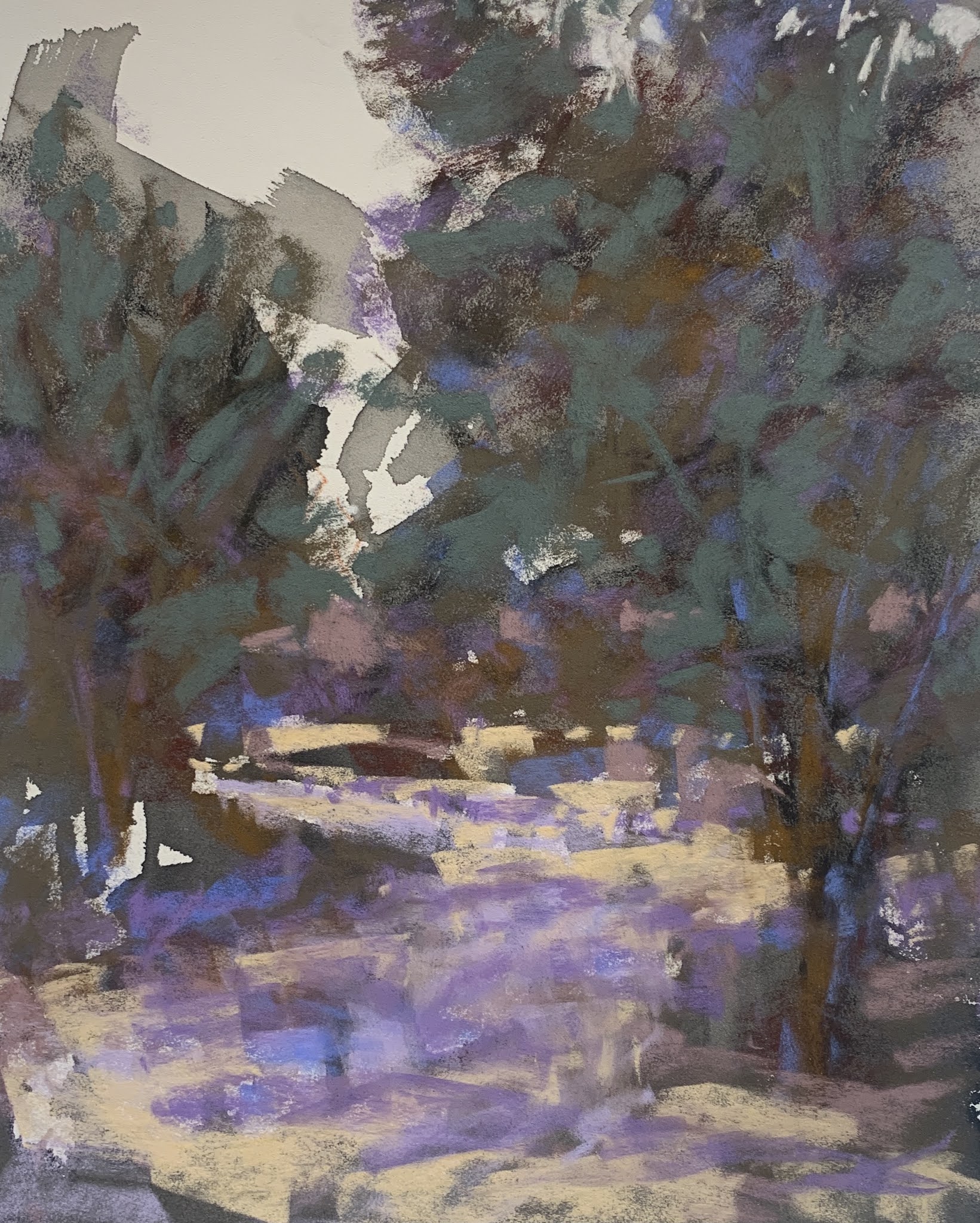
14x20 pastel "Ride to Summer Camp


 Often I think we as artist are moved by a scene. We forget to ask ourselves the most important of questions "What is it I want to say about this scene?" "How does this scene make me feel?" This scene is particularly moving to me. It brings back many memories that I have. We went camping for a week in the back country next to Yosemite. It was an adventure, lush scenery and always brought peace to me. I really miss those days. That was 25 years ago, but I am able to invoke in this painting that feeling of togetherness, serenity and warmth that I felt on that day. This is one of the main reason it is important to use your on reference material for your paintings. Some, may not be able to do this because of physical restraints, but art is anything that moves you. Even simple household objects can become art. Isn't our goal as artist to show others (who may not be able to see the beauty in everyday objects) where that beauty lies? There is such a rush in our everyday lives that most of us don't notice the beauty that is right in front of us. 

With this particular painting, the line concepts all point to the riders. Follow the background tree line, it merges with the riders or points to them if you will. The dark pine trees encircle them, the path then leads you in from the bottom of the painting. You are able to re-enter with any of the shadows in the foreground. The hardest edges are the riders and the dark tree trunks around them. Yellows and golds come forward in the painting, while the cooler and grayer colors recede and take you into the painting. There is division of space with the little tree in front of the tall pines and then the background trees. I wanted to express the magnificent majestic feeling it is to travel under trees that have lived for so long. 


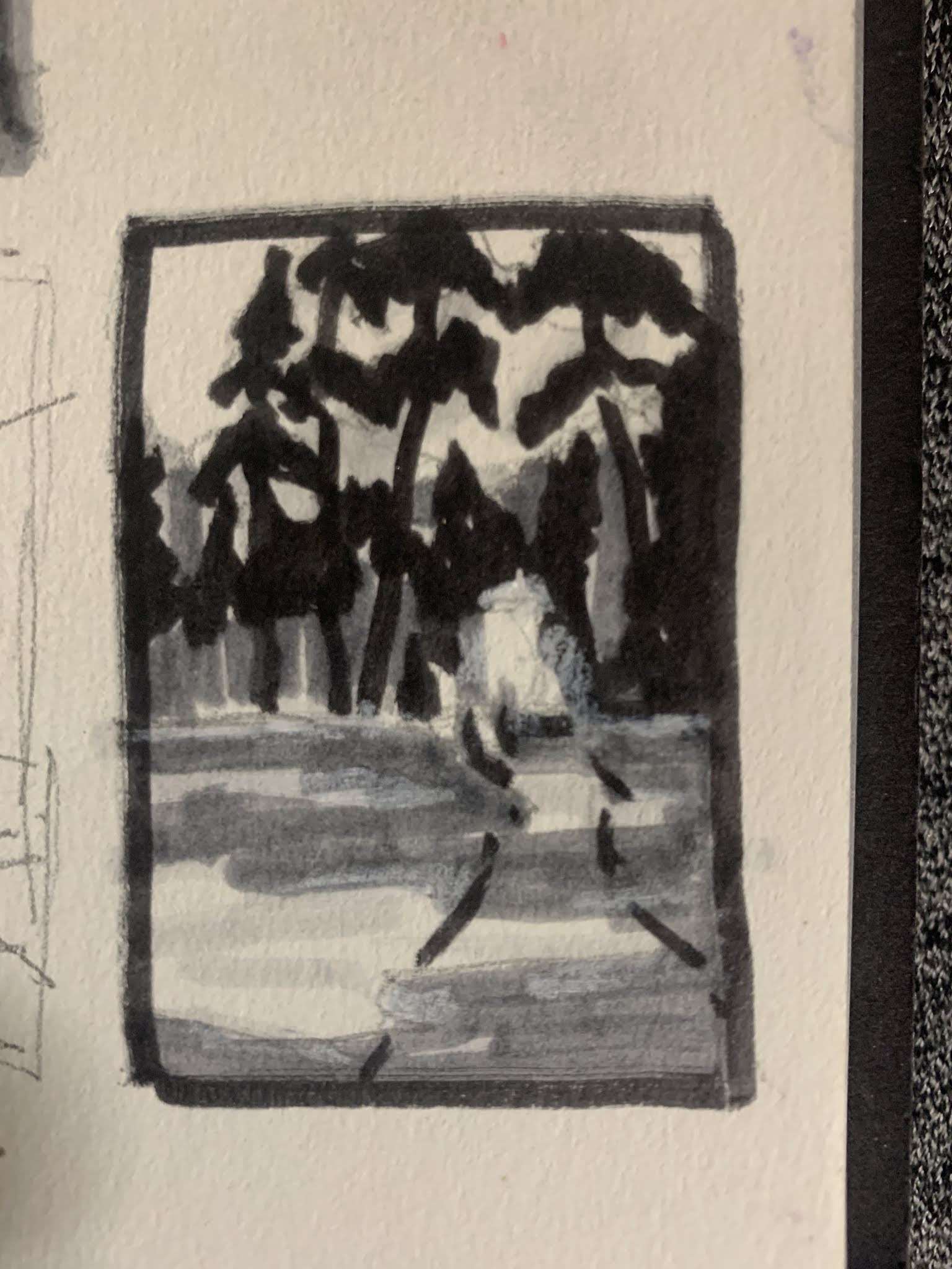
This is the line concept I used to design the composition with. See the box off center & to the right? This is the representation of the riders. I felt I was going in a good direction with the composition after I quickly jotted this down. It doesn't have to be anything elaborate, just notes to yourself. Use this like a map. If you do this prep work consistently in your work you will have more paintings that are successful instead of just once in awhile. There will come a time with repetition that this becomes automatic and you might not need to actually record it. But, it will be in your mind. 

Always remember, shadows are usually 40% darker in value then the object in the light. They also, are shades darker from the original  color of the object. There can be color that bounces off the object onto another in a shadow. Example would be a red ball in light with a reflection on a blue wall will have a hint of the red on the wall too. Usually, in the landscape on sunny days the shadows will reflect some blue from the sky, and cool violets. Observe closely objects in nature and shadow. This will help you understand the concepts and re-produce them in your art.

Remember to feel your way through a painting. Invoke what moved you within your subject with value, line, color and intervals that are interesting. Watch you shapes, are they interesting? Do they all look the same? Do I have soft and hard edges, contrast next to the focal point? Be careful to identify tangents. Our brains just go there unfortunately and we have to make a conscious effort to review these important questions before we release a painting to the public. 


Tuesday, March 23, 2021

How to Bring a Painting Together

 Ride to summer camp

14x20 

The photo reference I used for this piece was taken about 30 years ago. As a family we planned a trip with 5 of our horses and the kids. Troy brought a friend. We went for about 1 week into the Emigrant Wilderness next to Yosemite. This particular photo was taken by my son across an open meadow high up on the trail. The picture itself was not the best to use but did give me the sense of our crossing it. I remember it was warm, and there was plenty of Lupin flowers growing in the open. We sometimes would come across others hiking but this high up it was rare to cross someone else. My daughter and I rode, Nile rode off and on and gave the 2 boys a chance to ride at times. We went back into that country 14 miles. Mostly, followed lakes and would stop to camp and fish often. It is a wonderful memory for all of us. I rode taxi who was a huge red spotted leopard Irish thoroughbred, Wendi rode pokey, a well built quarter horse from Poco Bueno bloodlines. CJ and Buck carried our gear, Classey was ridden by Nile. 

I look back on this photo and a few others from that trip with fond memories. All the horses have since passed on, kids grew up and moved away and Nile and I divorced. So that life is gone. I do miss all those things we did. 

How did I get this all put together? I stared at this photo for years, knowingly that I longed to paint it but not quite sure what to say about it. So it stewed and stewed.

It's important to understand what attracts you to a scene or photo. What does the piece want to say? What kind of mood do you want to give the piece? For me this was about not only the beauty of the back country, but the quiet that comes with it. This is what it was like for the first settlers to come into California or the Indian tribes that dominated the area. 

So I started with line drawings. I did this to work out the flow of composition. I knew basically what I wanted it to say. 

As you can see I chose the vertical format. The important things for me about this scene is the majestic canopy of trees we were riding under. Thats what was important to me. All trees in the forest take years even hundreds of years to reach some of these heights. As a group of people that automatically becomes a focal point. I represented this as a square shape and made sure all lines lead to this shape


By doing this first, I have saved myself steps in the painting process, the planning process and I hope a successful piece. 


Next I examine the shapes. All shapes are divided by light and dark. Only these two things are considered. I am checking to see how the shapes connect to each other, are they pleasing shapes, and are they boring shapes? This is one point to make design changes in your planning process. This is your notan. It is the foundation that your painting will develop from. Each painting MUST be evaluated this way until it becomes a habit and can be seen without working out all these steps. In the beginning however, you must include all the steps to see design. Remember NO DETAIL at this stage of planning.

Ask your self; Do my shapes connect or is it spotty? How can I join these lines? 
Next ask yourself; do these shapes feel balanced?


Next work out the values. I use a 4 step value process. White of the paper, middle light, middle dark and dark. I also use Tombow markers because they don't bleed through the paper. But, you can use varying pressure with pencil or  pen. At this stage I follow Carlson's guide to landscape painting. He designates values by planes. The planes are the lightest light is the sky, mid lights are the flat planes across the landscape, mid darks are slopes or mountains and tree shapes are the darkest dark. This value step showen above follows his guidelines. This lays out how I begin my painting and how to stay true to the values so I don't get lost. When beginning a painting I use this as my starting point. Not the Photo. The Photo used at this point is ONLY used as a reference for placement of objects. Keeping in mind that I may have moved shapes to make a better composition. 


Next I do a small thumbnail using this information and building on shapes and patterns. This may seem to have more detail but it really has only enough for me to work out basic information on the subject. I use this sketch to place my subject on the paper. I'm only concerned at this point that my shapes are correctly placed, that they are pleasing, and is my FP in the place I want it. 

Next I did an underpainting. I know where my values are so I was able to pick some inktense art stick based on value. I used two dark shades of purple for the darks, yellow and oranges for the lights and just a hint of blue in the sky. I wet with this a very inexpensive stiff brush and water. I started with the sky and the lights and then went into the darks. I used a controlled amount of water in each section. Sometimes I got runs but I did try to control this somewhat. I also let the colors mingle in places. When this was dry I had a very vibrant underpainting to work with. At this point, the only color decision I had made was the compliment color set up for the underpainting and identifying the lights and darks with it. Unfortunately, I did not take a picture of this. 

I did however start with my darkest cool darks in pastel and a very light touch started to identify these places. I chose next some basic colors of the scene and in the lightest light I used warmer colors to move into those spaces. One I identified that, I decided I wanted the sky to be a grey color. Here I layered in light colors (same value) blues and oranges to create a grayed down but vibrant sky. I did leave larger areas of underpainting showing to continue to guide me with color choices. 

As I continued through the piece, I let my intuitive sense take over and responded to color by its value, hue and intensity as I placed it around the painting. I know as things recede in a painting you have atmospheric conditions that cool color down, gray it and dull it. So when I addressed these areas I keep that in mind. I also know that complimentary colors vibrate when placed next to each other (even if they are grayed and dull). I love this about color.  I like my color to sing out, so I paint that way. I always have had a sense for that.  Some people have line, simple shapes and such that becomes your style. It does develop and we as artist just try to identify it and embrace it. 

Over all I think this painting is successful. I leave it up for awhile to look at and see if and where it may need corrections. I do study other artist I like and see how they have worked through their pieces. I think, if it worked for them, maybe I can try it. I try to avoid ambiguity in lead in lines. If something looks like a bad shape or unclear I fix it. I don't go over the entire painting. At some point you have to trust yourself. 

Happy Painting
Debi


Saturday, March 13, 2021

Painting what you see

Keeping it loose


Sketch, Sketch, Sketch everyday. You won't get better as an artist unless you learn to see. Sketching does that for you. Keep a pocket sketch book and minimal supplies with you even in your car. Sketch everything that interest you. Learn to see the colors in shadow and in light. Best advise ever! I wish now I had more sketchbooks filled than I do. 

Paint what you see...easy right? Well, not all the time. Take your notes while you're out, use the photo as a tool to help with color notes and values, but let free yourself once you get the bones of your scene down. Use gouache or markers to help you through. The more time you spend on preparing for the painting the looser your strokes, the less you feel like you have to copy what you see. The more you can feel free to change the colors and mood you want to portray.

I have multiple photos I can draw from that I have taken. If you truly understand the landscape then you'll be able to paint what you feel too. Remember to keep in mind that the camera sees the images as flat. It will make the darks look black and the lights will be light. If you just use it as a starting point of shapes and values, you can let your imagination free. It's so wonderful when that happens. Your paintings may take on an abstract feel to them. There are artist that love to paint photo realism. Their work is amazing, but if you look closely you'll be able to see where in areas they have taken the liberty to introduce dynamic color. 

So how do we get there?

  • Take the photo - thumbnail and frame it with a dark L shape mats to really pop out the area of the photo you find interesting. Remember each photo can have multiple areas of interest for paintings.
  • Find the horizon line and mark it with a marker. (I use 3 values of TomBow markers). Do the darks first. Then, block in the midvalue. Let the lights be the light of the paper. Use the main structures only in the scene for this. It's ok to cut parts out of the photo. Leave big uninteresting areas that scream for attention out. It's ok to not look at the photo. Try really hard to not look at the photo for any detail. Keep it simple. It's ok to cut the sky out if to much, and ok to leave large foregrounds out too. Very SIMPLE is key
  • With your markers draw a 2x3 box and work out the simple shapes only. Is the composition pleasing? When you have worked that out you can transfer it to the painting surface.
  • Block in the big simple dark areas. Just shade it in. No need to draw, your objective is to stay loose. use an old brush to wipe out some of the charcoal to show a value change if you want like I did on the side of the mountain. 

This was blocked in with wood charcoal

  • The example above was completed on a half sheet of art spectrum paper in gray. 
  • Remember, to paint
    •  Dark to Light
    • Light touch to thick strokes
    • background to foreground
  • Squint Squint and Squint again to see shapes and values. Do this throughout the painting process and step back often to evaluate 
  • Use broad strokes, light touch to identify local colors
    • Block in darker background trees or objects, use a mid value color to start with
    • Then move to background (far distance) 
    • Try out a sky color, when you find the color you want put that in. Make sure to use a light touch around the foreground tree shapes so you can add sky holes later
  • Remember to play down non focal area
    • Not important objects in the scene. Rule of thumb: If it doesn't help in the design it might not need to be there
    • Look at your edges. If they are not the focal point then they should be soften. Especially things sitting in the far distance. This will help to push those objects back further in the picture plane. 
  • Foreground treatment
    • Add a few bright colors to indicate where the values will be
    • Try out very bright colors in small bits with soft edges
    • Add brighter strokes on the horizon line to separate the planes visually in the painting
    • Use large and small strokes to help lead the eye into the painting
    • Try a little grayed color to the bright horizon line.
    • Try very little but, bright lights in the background trees. 
    • Use also, gray greens to balance color
  • Mark Making
    • It matters! mix flat strokes with line strokes in grasses
    • Short small minimal strokes in foreground

Rule of thumb notes

Water

  1. Light passages (like the sky)are usually darker in water reflections 
  2. Darker passages are lighter in the water (reflections or shadows)
  3. Start with lighter passages of the sky and soften the edges
  4. In the front of the painting go even lighter in some of the passages 
  5. Indicate foreground foliage colors with the water colors
Most of the picture should have the initial block in done

Putting it all together

Refine your painting. Check for;
  • brighter colors and smudged edges
  • touch up the darks


Wednesday, March 3, 2021

Working through a pastel painting

 Working through a pastel painting

Planning Stage

First I find a pleasing composition and value study. Below I used warm TomBow markers to help identify the values. Notice the lines were loosely placed before I worked on the values.This is my idea I want to try.


Next, I place my paper in the vertical format on my easel. I use this sketch book design to place my shapes onto the paper. I used vine charcoal for this part.


I took the line drawing and placed a very small amount of black acrylic ink into a throw away plastic cup. You certainly don't need much. I then wet my brush with water I had available and put the design down on the paper. This is light gray pastel mat. I love the drips, to me they create a vibrating energy I want to show in my painting. 


Today I picked out some starting colors for this painting (on the first inked example if you look closely there is a color guide I made with these examples). This is my identification process to see not only how all the colors work together but, to identify values of my choices. I don't always do this, but I wanted to free myself up for application of lines and energy, so I thought this might help me. Always try to make your painting process easier for yourself. So if multiple sketches, color studies feel like they need to be done, then you should do it so you are very familiar with your subject. I often have an idea for what mood, composition and colors I want to use in a painting. With this in mind I know how my colors will react with each other, next to each other and so forth. This frees you from using your left brain and letting the right take over. I've always painted this way. The left side of our brain is the analytical side. It likes to figure things out, read, write and solve mathematical challenges. Hard to get past this stuff sometimes. So your goal is to engage the right side of the brain. This is your artistic side. This is the side famous painters, musicians and discoveries are used while creating. I listen to inspiring music often piano, acoustic guitar and old Gene Autry music. I also take this time to listen to audiobooks. I find the distraction allows the right brain to start creating and I find that I'm not thinking about the process and just being intuitive with my painting. It's a wonderful feeling, to set aside everything you think about normally and just let go. 


This is after the first pass. I really like how this piece is going. I've only lightly applied the pastel. I've used my dark selection in the foreground trees, identified the pathway and the shadows. I haven't laid in color for the sky yet but if you look in the high right corner you can see a bit where I tried some color for it. Not sure at this point if I want to use it. Seems to light right now. 


So here, I've identified some of the background plane. Notice my color choices are lighter and duller. This helps to push that background plane back further creating a 3D effect in the viewers mind. The composition is clearly a Z pattern of the pathway through the trees. I have color harmony and the foreground is cooler colors, and the background although duller are warmer versions of color. It is a good rule of thumb to decide if your foreground will be warm or cool and vice a versa before you start your painting. My warm background has the potential to pop forward too much so that is why the colors must be duller or grayed down if you will to keep that plane in the background. You can see I've started to explore some sky colors and have added a darker gray to it which I like. 


Here you see I've taken it a bit further. Notice the orche color in the middle ground is also in the foreground tree on the left. It also is by the purple tree shadow. It is a good idea to use color in a few spots to  help move the eye around the painting. Karen Margulis calls them spice marks. I feel at this point the tree on the left is too dark. I like the background, it seems to sit back where it should. 


I continue to carry out my idea and even sign my piece  ðŸ˜‰. LOL then I decided that I didn't like the foreground tree shape. So now I started the picking at my painting, looking for corrections. It can be a pitfall for all of us. I decided the tree on the left was to dark, I didn't like the trunks on the background trees. So I started fixing things. 😞


So this is where I left it. I lighten the tree on the left to set it back. I changed up the foreground tree to a shape I liked better and darkened it on the overlapping edges to bring it forward more. I decreased and grayed down the values in the background too. I worked on the pathway colors. I was concerned that my color was to spotty between the planes so I calmed the blue down in the background too. I wanted the blue in the tree and its trunk to make the foreground tree sing and ultimately get you to look there. Notice the value of the blue is the same as the purple so it could be effectively used to move your eye around the painting just taking away the strength of it in the background but still moving your eye around the painting. It's now hanging where I can look at it for a few days before I put it away. 

My take away from this piece is; 
  •  keep my planes clear to the viewer.
  • working on pathway colors (it almost looks like snow) needs variety
  • dulling the background trees even more or darkening the foreground tree to define the planes
  • keep working on loosening up my mark making

Is it perfect? Heck no. Every piece I do I try to learn something I can work on with my next painting. I didn't let much of the ink show through and I wanted that so that is something to work on also. Do this breakdown of every piece. Do you see the Z composition? It's the path, in the lightest colors of the painting. I'll talk about this more in another post. You'll be able to find it under the composition label. 

Have fun painting!😀


Drawing shapes: simplifying & line importance

Line and Simplify Shapes

We will talk more about shape identification, how to use that to your advantage. Also, we will start with the line shape and drawing it. We're not done with the photo either, there is so many things to say about it. I want to encourage you to work from life too. It is the very best way to learn to draw.


Lines

How does line help? Well, it will be the absolute first thing you put on your paper for design purposes. The concept of the line identifies the basic shape placements, how you lead the viewer through the painting, and your basic composition. I can't express it enough how important this concept is in composition. 

  1.     Rule: Line decides the composition in the most basic sense. It should be an uneven space devision.  Never forget this rule. Our brains are made in such a way that we unknowingly will space things even, but our visual senses like uneven representation of our visual field. This is a basic concept that is stressed in Carlson's Guide to Landscape Painting.  Every artist should have this book. Also, another book that I think should be in every artist library would be Drawing Scenery: Landscapes and Seascapes
  2. The first step would be to identify the horizon line. Remember to keep spaces uneven. Ask yourself; is this drawing about the sky or the earth? Then place your first line after you decide the frame of the picture (rectangle, vertical or square). 
The concept here is on how to divide your space and where to start. 

The next line could maybe represent a tree. The bottom picture represents how a line can stop the viewers eye from traveling around the picture plane. 


The idea here is to show you how a line can cause the viewer to stop. 

If this happens the viewer in this case has nowhere to follow through with the painting and will move on to another. The important concept to take away from this is how important lines are to create a pathway to leave and enter the painting multiple times. As you see in above photo the top picture design has more ways to enter the painting, but the bottom example is awkward for the viewer. 

This next example is the use of multiple lines that leave the painting edges allowing the viewer multiple ways to enter and leave a painting.


See how this example is pleasing to the eye? I would suggest that you explore the line concept with your references in the sketchbook. The more basic exercises you complete, the more it sticks and becomes a auto reflex of sort to make better paintings. Curves can be used to represent parts of the painting. I would suggest No Values should be explored at this stage, Only how the lines can direct the eye. This is a foundation piece to good drawings. We must learn to crawl before we can run. 


This is just an example on how lines might work, both complete to all edges and incomplete. Since this is about the sky we could dissect this as the horizontal lines maybe be a pathway (river or road) to the red line. So the FP could be that object (house, tree, sign or telephone line). The dark lines in the sky could of course be clouds or even just a color change. See where I'm going with this? Lines can be curved too. Just a simple suggestion is all that's needed. This could be a very busy scene for a first painting so I would suggest something much more simpler from your reference photos.

Keep it really simple


Here is the photos that the line concept above represent.


Shapes

Shapes are simply the overall design of the landscapes. Shapes can also be described as the bones of a painting using the line concept.

How do I identify shapes? A good way is to turn your photo to black & white to help identify these shapes. You'll be looking at value (is it light, medium or dark)? How do these shapes connect? Is there blurred area where the shades melt together? That's what you are looking for. Example might be this landscape

Squint your eyes and see the large shapes.

Notice the green shapes are in the foreground and appear very dark. There also is two shapes in the background that are pink.


 Let's review the green shapes first. Every photo makes the darks appear darker than what they would be in real sunlight. They are on the same plane in this photo. Lets look at planes in a photo. Well, what in the heck does that mean? Planes are divisions that depict where objects sit as they recede back in space. This helps to create a 3D effect on a 2 dimensional surface.

The pink area is the foreground, the green is the middle ground and the orange is the background. The sky and river have their own shapes too, I just didn't identify them in this photo.

It looks like we have 4 big shapes. But wait, the green areas are not connected well. See how we can connect them with that sliver back by the thin area of red shape? We could use that shape to connect the greens together. That gives us one big green shape.


The blue areas mark similar light values (lets give it a 3 on a value scale)we might want to consider for this painting. We may also decide the blue value of the river is a step down in value (4). Then red designates the darkest value (value of 7) with the green areas the next value 5or 6. Since the green areas are darker  but not as dark as the red shape of the tree line. The orange area is for us to remember this is the furthest plane away from us and must be treated as a value lighter that the foreground. It's another concept to learn (arial perspective) which we will tackle in another post. Just remember things get lighter and duller as they recede in the landscape. 

This might seem all too much, but look at your references and try to pick out the large shapes, squint and connect the shapes where you can. Identify the planes. Value and color choices will depend on these. Try blending the green shapes together. Make a notan of 3 shapes. Does that look pleasing to you? Use light, medium and dark marks to see. In this case I would first make the sky and river separate from the earth. Then try to pick out the dark in the earth area. Thats part of the bones. Review my notan post as this discusses this concept with photos to help you with understanding. 

Your goal is to simplify your shapes. If you succeed in this it will make your painting process more intuitive because, you have worked out all the hard stuff first. This equals less frustration and more fun. 

We'll explore this simplifying more in my next drawing post. Until then keep practicing in your sketchbook, plain paper, napkins whatever works for you to draw. spend 15 minutes on it every day. Pretty soon it will be automatic and then you'll be able to see it without having to do the exercises. It's a wonderful feeling when that happens. 


Introduction

Introduction

 Hi  I'm Debi.  I wanted to start this blog along time ago, but I just didn't have time with work and life. Now, working part time I...