Search This Blog

Showing posts with label notans. Show all posts

Saturday, May 22, 2021

How I start a painting in oil

My  Oil painting process


You know I really like working with oil. It's so easy to blend and soften edges and most important to me is the color I mix and put down on the canvas dries that color. Unlike acrylics which dry a value darker, and faster than oils. I still love working with acrylics, don't get me wrong. 

How I decide what to paint

First I decide on the subject. 
How do I feel about it. what is the mood? Why do I like this subject? Do I need to crop and decide to move objects to make a better painting? How much do I have to alter it and do I feel confident to make those changes? Before deciding even the color I work this out in a sketchbook.

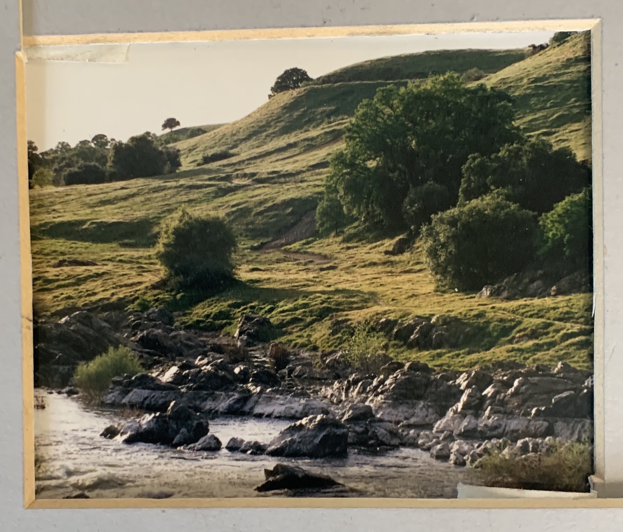
This is the painting I wanted to do for along time. It's my grandchildren at the beach at sunset. They are very young and it's the first time to a beach. They lived in San Diego for a year and experienced so many new things. 


©️reference image for "Sunset Beach"
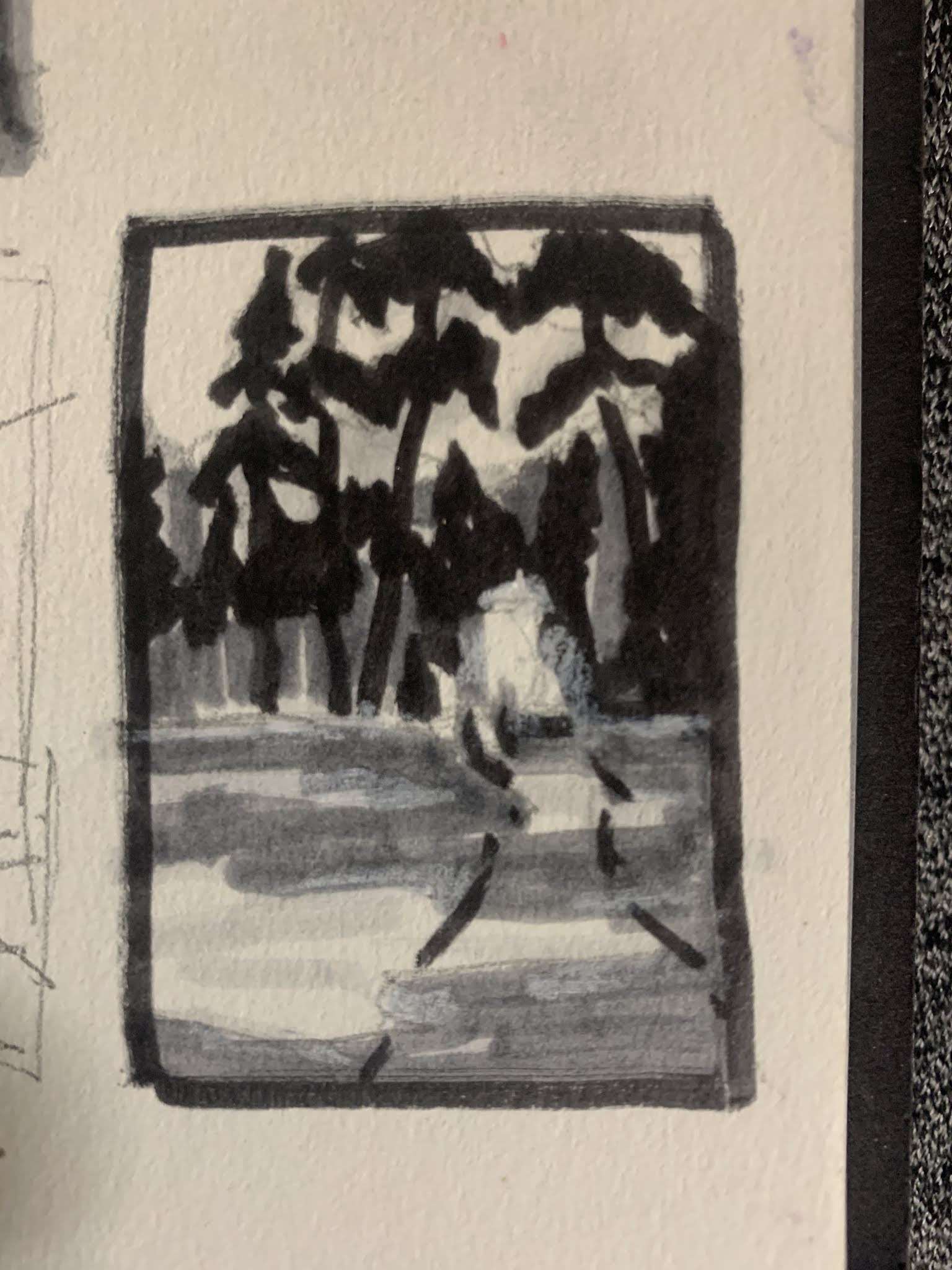

First question, What do I need to fix for a pleasing composition? I did some research on famous artist that I like. I found for me, they used the triangle most of the time in they're paintings. I think this would work wonderful for my idea. So I took the photo to the sketchbook. 

sketch work

I tried a couple of formats and ended up liking the square the best. If you look closely you can see how I divided the original photo up to maintain accuracy. 

I first, divide the photo from corner to corner in both directions after printing a small 2x3 or contact sheet size of the picture. This helps me to find center where I make a horizontal & vertical lines to place the shapes and they're relationships into my square format. I did end up removing the figure at the top of Kenna's head and moved the background figure to the right upper part of the painting to create the triangle composition in my final drawing. 
At this stage I also just focused on the black and white of the shapes. I wanted to see how my values would work in this format. Is it pleasing? How will I lead the eye through the painting? Where is my strongest focal point going to be? What is the most interesting? Does this format express the feeling I want to say?
Once I decided on these questions I had to decide on a color palette. I really loved the colors in the photo and I could express them even more in the painting. So I decided on a blue, orange and violet palette. 

My colors would be:
Titanium White- the work horse, cools and lightens value
Buff Titanium- a nice choice to lighten the color, gray it down slightly and change the value less than white
Cad Yellow medium- My warm yellow, blends and grays with it's compliment nicely
Yellow Orche- My warm golden yellow that has notes of brown. This makes a nice greenish color when mixed with blues, a nice warm blonde for hair color
Cad Orange - I could mix this orange but it is easier since I not only love this color, but will use it to create that sun glow through out the painting. Use sparingly on skin tones mixed with a red
Alizarine crimson- A nice darkish clear red, used to mix into a lavender for the under painting and shadows. This color is throughout the painting as a unifying color. Mixes well blues, orange and my yellow choice.
Quinacrodan Magenta- A clear rose red for skin tones and the darker hair colors. Makes clear shades with Burnt Sienna and Burnt Umber
Cobalt Violet- For an easy violet mixture that is on the coolish side. Also, easy to mix and is a convenient color to save time on my palette.
Cobalt Blue- A clear blue, that mixes well with the reds and oranges for beautiful grays.
Cobalt Teal- Another favorite I keep on my palette. Easy to mix, but since I like it so much this color works itself into my paintings much of the time
Burnt Sienna- Is a warmer brown that makes great skin tones and grays when mixed in small amounts of lavender.
Burnt Umber- A great color to aide in making darks. Almost like a black
Cool Gray- I use this also for convince if I plan to use grays in a painting. This unifies across the painting in cool tones and helps other colors gray down without mudding the color. 

I used Gamosol for my to clean paint off brushes during the painting process. To help dry the oils faster I used a walnut alkyd medium. I dipped my brush in this to keep the paint fluid and not to sticky. I clean my brushes with Turpinoid Natural. I could of changed the Gamosol to Walnut oil or linseed oil, which keeps the brushes clean and the paint fluid. It also reduces the faint smell of the Gamosol and is a healthier choice. I have tried to keep my materials as healthy as I can for painting. I found these be the healthiest choices out there. 

Next: How to draw your subject and transfer it to the canvas. This technique is useful for all painting processes including pastels. 


Tuesday, March 23, 2021

How to Bring a Painting Together

 Ride to summer camp

14x20 

The photo reference I used for this piece was taken about 30 years ago. As a family we planned a trip with 5 of our horses and the kids. Troy brought a friend. We went for about 1 week into the Emigrant Wilderness next to Yosemite. This particular photo was taken by my son across an open meadow high up on the trail. The picture itself was not the best to use but did give me the sense of our crossing it. I remember it was warm, and there was plenty of Lupin flowers growing in the open. We sometimes would come across others hiking but this high up it was rare to cross someone else. My daughter and I rode, Nile rode off and on and gave the 2 boys a chance to ride at times. We went back into that country 14 miles. Mostly, followed lakes and would stop to camp and fish often. It is a wonderful memory for all of us. I rode taxi who was a huge red spotted leopard Irish thoroughbred, Wendi rode pokey, a well built quarter horse from Poco Bueno bloodlines. CJ and Buck carried our gear, Classey was ridden by Nile. 

I look back on this photo and a few others from that trip with fond memories. All the horses have since passed on, kids grew up and moved away and Nile and I divorced. So that life is gone. I do miss all those things we did. 

How did I get this all put together? I stared at this photo for years, knowingly that I longed to paint it but not quite sure what to say about it. So it stewed and stewed.

It's important to understand what attracts you to a scene or photo. What does the piece want to say? What kind of mood do you want to give the piece? For me this was about not only the beauty of the back country, but the quiet that comes with it. This is what it was like for the first settlers to come into California or the Indian tribes that dominated the area. 

So I started with line drawings. I did this to work out the flow of composition. I knew basically what I wanted it to say. 

As you can see I chose the vertical format. The important things for me about this scene is the majestic canopy of trees we were riding under. Thats what was important to me. All trees in the forest take years even hundreds of years to reach some of these heights. As a group of people that automatically becomes a focal point. I represented this as a square shape and made sure all lines lead to this shape


By doing this first, I have saved myself steps in the painting process, the planning process and I hope a successful piece. 


Next I examine the shapes. All shapes are divided by light and dark. Only these two things are considered. I am checking to see how the shapes connect to each other, are they pleasing shapes, and are they boring shapes? This is one point to make design changes in your planning process. This is your notan. It is the foundation that your painting will develop from. Each painting MUST be evaluated this way until it becomes a habit and can be seen without working out all these steps. In the beginning however, you must include all the steps to see design. Remember NO DETAIL at this stage of planning.

Ask your self; Do my shapes connect or is it spotty? How can I join these lines? 
Next ask yourself; do these shapes feel balanced?


Next work out the values. I use a 4 step value process. White of the paper, middle light, middle dark and dark. I also use Tombow markers because they don't bleed through the paper. But, you can use varying pressure with pencil or  pen. At this stage I follow Carlson's guide to landscape painting. He designates values by planes. The planes are the lightest light is the sky, mid lights are the flat planes across the landscape, mid darks are slopes or mountains and tree shapes are the darkest dark. This value step showen above follows his guidelines. This lays out how I begin my painting and how to stay true to the values so I don't get lost. When beginning a painting I use this as my starting point. Not the Photo. The Photo used at this point is ONLY used as a reference for placement of objects. Keeping in mind that I may have moved shapes to make a better composition. 


Next I do a small thumbnail using this information and building on shapes and patterns. This may seem to have more detail but it really has only enough for me to work out basic information on the subject. I use this sketch to place my subject on the paper. I'm only concerned at this point that my shapes are correctly placed, that they are pleasing, and is my FP in the place I want it. 

Next I did an underpainting. I know where my values are so I was able to pick some inktense art stick based on value. I used two dark shades of purple for the darks, yellow and oranges for the lights and just a hint of blue in the sky. I wet with this a very inexpensive stiff brush and water. I started with the sky and the lights and then went into the darks. I used a controlled amount of water in each section. Sometimes I got runs but I did try to control this somewhat. I also let the colors mingle in places. When this was dry I had a very vibrant underpainting to work with. At this point, the only color decision I had made was the compliment color set up for the underpainting and identifying the lights and darks with it. Unfortunately, I did not take a picture of this. 

I did however start with my darkest cool darks in pastel and a very light touch started to identify these places. I chose next some basic colors of the scene and in the lightest light I used warmer colors to move into those spaces. One I identified that, I decided I wanted the sky to be a grey color. Here I layered in light colors (same value) blues and oranges to create a grayed down but vibrant sky. I did leave larger areas of underpainting showing to continue to guide me with color choices. 

As I continued through the piece, I let my intuitive sense take over and responded to color by its value, hue and intensity as I placed it around the painting. I know as things recede in a painting you have atmospheric conditions that cool color down, gray it and dull it. So when I addressed these areas I keep that in mind. I also know that complimentary colors vibrate when placed next to each other (even if they are grayed and dull). I love this about color.  I like my color to sing out, so I paint that way. I always have had a sense for that.  Some people have line, simple shapes and such that becomes your style. It does develop and we as artist just try to identify it and embrace it. 

Over all I think this painting is successful. I leave it up for awhile to look at and see if and where it may need corrections. I do study other artist I like and see how they have worked through their pieces. I think, if it worked for them, maybe I can try it. I try to avoid ambiguity in lead in lines. If something looks like a bad shape or unclear I fix it. I don't go over the entire painting. At some point you have to trust yourself. 

Happy Painting
Debi


Sunday, February 28, 2021

Drawing

 Drawing and interpreting your scene


What do we do with that photo! That is a great question. A photo can supply you with multiple scenes within a scene to choose for painting. Cropping is key to make this happen. You certainly can copy the photo as a whole, but what fun it would be to find other areas within the photo to make a painting with it. 

Now you have a sketchbook and value view finder lets put it into use. 

What do you want to say

What is it about this photo that attracted you to the scene? Was it the light and shadow pattern? What made you stop and take this picture? What is my focal point? 
    The Focal Point? What is that?
  • A focal point is what you pick to be the main area in a painting that you think is the most important part you want your audience to focus on or relate to. 
  • Next, is where in the format do you want this Focal Point or FP to be placed in the space of your format.
  • A format is the rectangle (in the landscape or vertical frame) or the square.
This is where you start. Typically we will begin with a rectangle and divide your box into thirds like so. This is done in any format you choose.


The 4 circles represent where your focal point might be placed. This grid may also serve to help you with the placement of objects within each square for better drawing accuracy. A photo should at the beginning  be in a black and white exposure to help you determine the shapes of your idea. Here is an example of what that may look like


As you can see I changed the photo to silver tone, placed my grid and identified where my FP will be placed. I also used the L's to breakdown this 4x6 photo I took to a smaller area within it. It is useful at this point to place your idea of this format in your sketchbook. Try and draw a likeness of what you see, making sure you follow the values with your drawing. Remember; not every attempt will be successful. This is true with every artist. Sometimes, we have to abandon ideas until we gain more experience. This is normal. Don't be hard on yourself. Check out my bookclub on drawing. Most of these books are available on Amazon. Draw using this process for multiple objects around the house inside and out. All things are paintable, don't get caught up with trying to find something to draw. Just use any picture or item laying around. (I would stay away from portraits at this point, including pets). However, if you want to do an exercise in placing them within a landscape, don't include detail. Our goal is to look at shapes not things.  The next most important concept is Make no two shapes the same. These two things will be true throughout the painting process no matter how experienced you are.

Next Time

We will talk more about shape identification, how to use that to your advantage and why its important. Also, look in my labels for information on notans. Also, we will start with the cylinder shape and drawing it. We're not done with the photo either, there is so many things to say about it. I want to encourage you to work from life too. It is the very best way to learn to draw.

Tuesday, February 9, 2021

Prepping for the painting

 Painting prep

First and most important there are NO RULES in painting. There is however, suggestions to help become successful with your paintings that have been discovered in our Art History. There is known pleasing design concepts to keep in mind. But you are the artist and you are in charge. Keep in mind the suggestions but you are not married to them. Give yourself freedom of expression in your work.

When preparing for any painting, it is wise to do the prep. Some artist who are familiar with painting and have been doing it for awhile skip these steps. That's ok. They have the experience to draw on to make it work. But, as beginners DON'T skip this part. This is where that sketchbook will become your best friend. Don't be afraid of failing in a painting, it will happen! It happens to even the best of the best. Sometimes we need several tries to figure out how to express what we see on paper. Don't worry about your style (mark making), it will come. You will create your own as you learn from others and practice. We want to create a habit in sketching. All successful people spend time practicing their field.


Reasons to sketch

  • Where to start?
You guessed it, sketching! Lots and lots of practice. I find the more I ponder over a painting the easier it is to actually do the painting process. Also, you will set yourself up for more winners than failures. Prep always, always, always paves the way to a more intimate connections with the subject matter. Who says you only need to paint something one time. The more familiar you are with the subject, the more expressive you can become with mood, mark making, abstraction or realism. As beginners, we want to depict our subjects as we see them with increased detail. This is normal. Eventually, you will want to branch out further and maybe move away from realism, this is normal too. Some will move to hyper realism and that's ok. You have to start somewhere (A Marla-ism).
  • Why was I attracted to this scene?

Why do we paint what we do? Do we have a fondness for the subject matter? Was it the light and shadow patterns? Was it the colors that grabbed us? These are all important questions to ask our selves before we paint. By answering those kinds of questions, we are already making decisions on how to paint our subject. Here is an example of a photo I took a very long time ago in California. I have taken the mat from a 4x6 and cut it in 2 corners to form 2 L shape mats. This is used to crop the photo into different areas within the photo. Why? In most photos of the landscape you can find at least 2-3 (maybe more) paintings or scenes you'd like to see if they can become a painting. A more in-depth look into photo use with art work will be in another post. But for now lets look at what we might use to help us get started.

This is the original photo 4x6


this is the cropped version of a potential pleasing design option

What is the reason I might like to paint this? The attraction for me in this cropping is the morning light and the tree bush design. Can I make this work? I don't know. Lets break this down and see. I did spend some time with thumbnails on this cropping of the photo.

  • Is this about the sky or the earth? (For Landscapes)
Is your subject about the sky? Is it about the earth? Is it a still life or portrait? This gives you direction on how to divide your subject matter within the frame you choose. Richard McKinley (Master Pastelist) always teaches this concept. Discussions on dividing spaces will be presented in greater detail under composition. 

For me this photo above is about the earth. As you can see above, I have very little sky in my cropping. This idea may look something like this. In each format rectangle, square or vertical I have taken the very basic shape and placed it with the sky dominate or the earth dominance. It is up to the artist how they want to express their painting. Or, they could try all formats in quick thumbnails to see which they like the best. This helps to familiarize yourself with the subject and become intimate with it. 

Possible formats of dominance of the sky or earth


  • What format do I use?
Is it a rectangle, vertical or square format? This is when you start making decisions with thumbnails. A view finder is VERY helpful if on location. L shape mats help to narrow down areas in the visual field or on a photograph. Try sketching in different formats what  you want to say. How well does your shapes fit into the format? Do the shapes have an easy flow to them. Here is possible options.

Format and Value options

I have taken the basic shapes important to the design and using the notan idea, flipped values around to see if any catch my attention more than others. These are possibilities left to the decision of the artist. None are wrong. Some just look better than others. 

The Notan.  Notan is a Japanese word that means "light-dark balance. It is an arrangement of shapes in the simplest form. To artist it is a way to explore the elements of design without having the distractions of color, texture and detail while designing the potential painting.
This is the most basic shapes of the photo above. I placed it in a square format to try for this study.

Basic Notan


Well, that's it for this post. More on Notan's and Photo use in your work to come. Don't forget to subscribe by email to get notifications of new posts. 

Thanks again, If I ever get the like button working (hopefully soon) we can use that. My brain is wired on the right for artwork and technology is left brain. But, I'll get there.

Have fun and sketch!!! If you do a little each day in 6 months you will see significant improvement. Start Today. 😉

Introduction

Introduction

 Hi  I'm Debi.  I wanted to start this blog along time ago, but I just didn't have time with work and life. Now, working part time I...